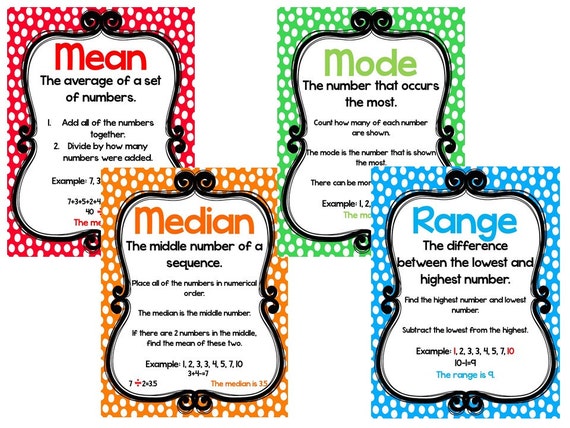
In weeks 7&8 we have been talking about data and how we can use that to assess children. We looked at how some scores can be presented. For most, it is a personal preference on how they would like their scores presented, and there are many ways to do so. There are many different graphs that can be used to visually show data, or portfolios can be used to document scores. In week 8 we worked on how to calculate some of the different areas of scores that include: mean, median, mode, range and standard deviation. We worked on an Excel spreadsheet to analyze the data and put it into bar graphs or pie charts, depending on what needed to be shown. I felt very familiar using Excel as I took a business class in high school that was Excel based. I know feel I have grasped that knowledge again, and I feel more comfortable.
The Excel practice we did in class shows one of many ways students scores can be presented. As a teacher, it is important to remember that there are many ways to analyze and assess data. By using different charts and thinking about what is most user friendly. These charts and graphs can also be very helpful to parents to see where their child falls in a certain category or subject.

Vocabulary Words to Remember:
mean: average of all the numbers
median: middle number
mode: number that occurs the most
range: largest number minus the smaller
standard deviation: variation of the answers


 .
. 


